As a strategic designer, I have explored how design thinking can tackle complex and wicked problems through structured and flexible approaches. Throughout my studies, I have learned to navigate different phases of the design thinking process: research, synthesis, ideation, testing, and implementation, using a variety of tools to analyze challenges, generate insights, develop solutions, and conduct iteration cycles to modify the results. During my MA, at SRH Berlin I have had the opportunity to apply these methods in multiple real projects, gaining hands-on experience and feedback in tackling multifaceted problems. My portfolio includes both conceptual explorations and practical applications, demonstrating my ability to work strategically within diverse design contexts. Some of those projects are mentioned as follows:


Some highlights of the DB project, 2023-2024
(enlarge images to see the description)


Het Concertgebouw project highlights, 2024
(enlarge images to see the description)


Mobile innovation lad project highlights, 2023, 2024
(enlarge images to see the description)
I have created infographics that transform complex data like research and academic phases in design projects into simple, visually structured summaries using symbols, shapes, charts, and conceptual visuals.
Additionally, I specialize in graphic recording, visually documenting workshops (or any event) in real time to capture essential discussions, processes, and takeaways. Here, two examples of graphic recordings for an ideation workshop and a testing (prototyping) session where insights emerge, are included I translate conversations and interactions into structured, easy-to-follow visual narratives. This approach not only enhances communication and recall but also serves as a valuable reference for teams throughout the design process.


Sample of the Infographics I designed, 2021 and 2023


Some of My Event (Workshop) Graphic Recordings, 2024
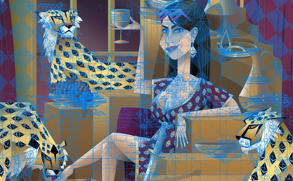
I have been working as an illustrator since 2003 starting with children’s book illustration. However, working a full-time career as a graphic designer in 2004, left me almost no time to work as an illustrator. Though I continued illustration as my personal interest and started learning new approaches and techniques. In 2008 I started making Illustrations using PC mouse and later digital pen in Adobe PS.
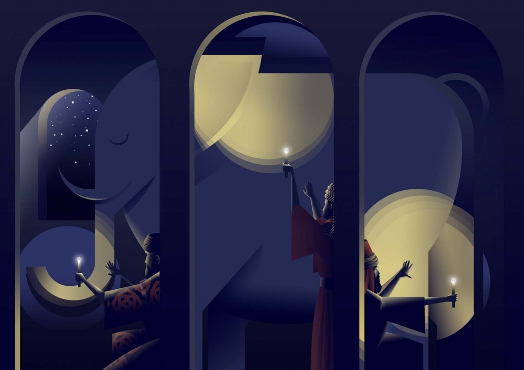
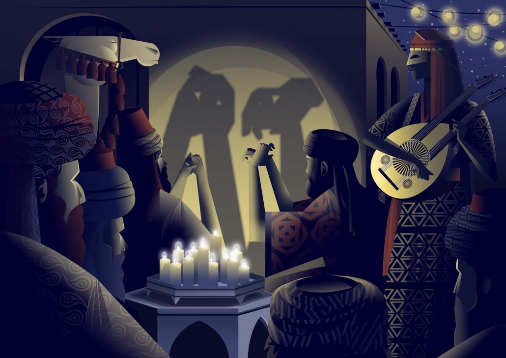
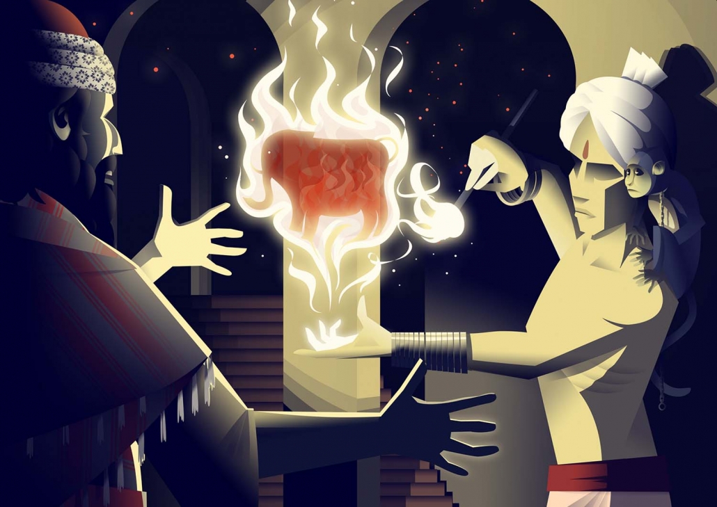
In 2017, I was approved for starting a postgraduate course of visual arts with concentration on Illustration in University of Tehran after a two-step entrance exam. During my education there I could find a more personal art style using vector shapes. Hopefully, the new style was welcomed in the market and festivals, made me nominated several times and qualified for exhibition in some of the major Iranian art events. The works shown in this page are illustrations based on an anecdote by Rumi called “The Elephant in the Dak”. The works won the main award in Iranian Illustrators Society’s annual festival (July 2022, picture above) and the frame in the middle-right was qualified for “Tehran NFT exhibition”, the first Iranian NFT art event held in Tehran (September 2022). They all three later were sold in NFT market, collected through offering bids.
Illustrating with vector tools gives me the freedom to play with shapes and adjust the artwork elements until I find the best form for either of the objects and components in my illustrations. The same choice is also provided with the colors and shadings. Unlike techniques based on digital pen, artists can easily modify each shapes’ color and shadings (shape effects specifically) to find the desirable composition. This technique also gives the artists the highest export resolution possible as the work could be scaled up (or down) with no quality drop. In this page pictures, some of my work progress and shapes’ details in Adobe PS are shown.
Previously, I used to work with digital pen and acrylic paint but now artworks created with such techniques are more personal or occasional due to clients’ needs. That is because I don’t want my personal vector art style be influenced by different styles to keep a more distinctive personality and brand in the NFT community. Here in this page, some of my illustrations done by digital pen and acrylic paint are shown.


Some of my vector illustrations 2020-2022 plus some work progress


Some of my non-vector illustrations created by digital pen or acrylic paint
My career as a graphic designer started in 2003 at “Hamayesh Afarinan” event management company, where, apart from executive duties related to organizing events, as a graphic designer I was responsible for designing all kinds of printed items for events such as IDs, tags, tickets, invitation cards, event brochures, timetables, and venue signage, which all were integral parts of the event we used to organize.
Later, by learning more associated skills I also was responsible for designing conference abstracts booklets and travel guidebooks for foreign guests. Although these designs only needed simple templates and usually lacked a rich artistic aspect -due to the clients’ frequent comments, they helped me a lot in mastering pieces of design software and tools.


Some of my earlier designs and layouts (2008-2017)
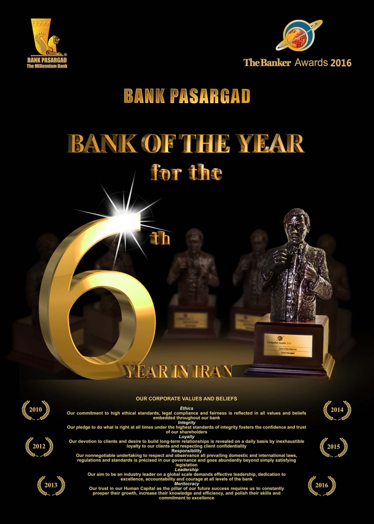
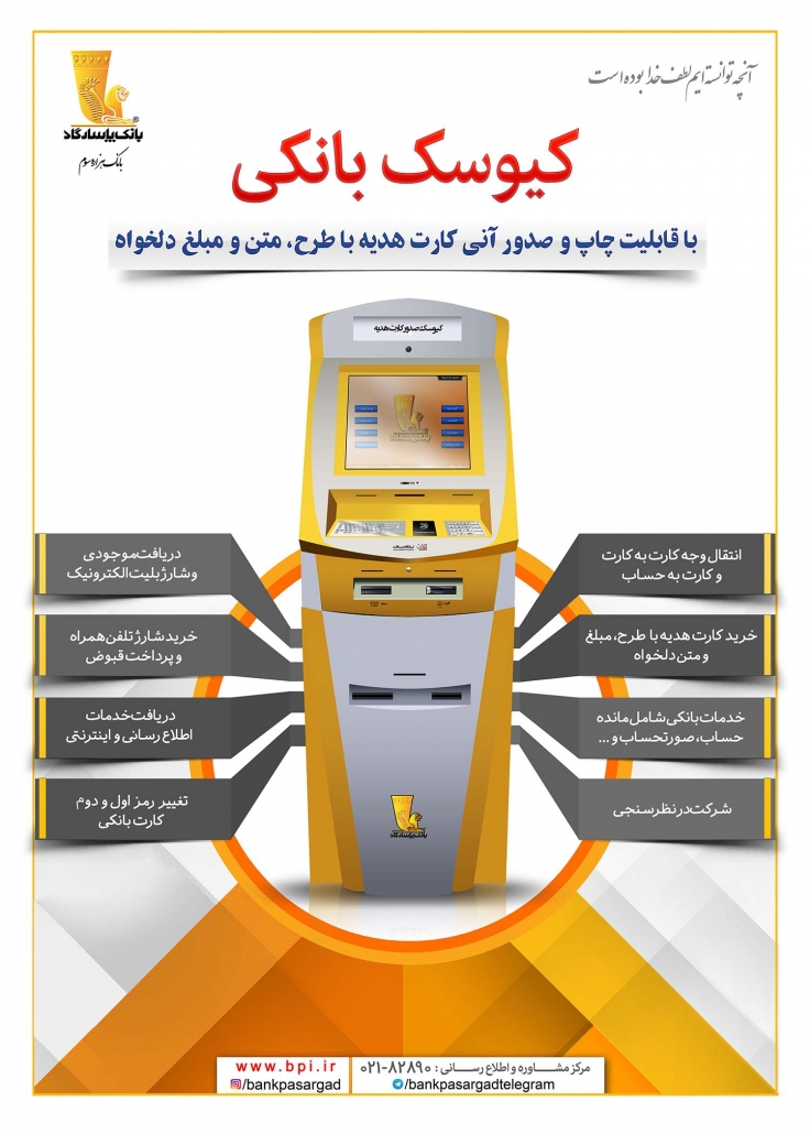
A new chapter of my career as a designer started at Pasargpad Bank by designing promotional items such as printed advertisements, stands, banners, and cover designs for the bank’s house organ (Images in the previous page, right column). At the same time as working in the bank, I was sometimes offered for commissions outside the organization, which usually included designing product/service catalogues, office papers, logos and business cards.
But since 2014, with the establishment the bank’s social networks and content team, I was responsible for designing posts for social networks. These posts included announcements, news, calls for Instagram challenges, and some banking cyber security advice.
Some samples of designs for Bank Pasargad social media (mainly Instagram page) posts can be seen on this page.


Some of graphic designs for social media posts
In recent years, I have known brand designing challenges better while working on brand identity for several clients and collaborating in the rebranding project of Bank Pasargad (my last employer).
Take designing brand identity for an insurance broker company named Etamad as an example; I had to have several meetings with the CEO in order to reach a vison on the brand attributes. Regarding the choice of colors, the integrated design for office papers and the website, and of course mascot design, the nature of the business and the perspective of the management were in the center of attention.
In this regard, the color blue was used as a symbol of trust along with a percentage of yellow resembling risk. For office papers and the website, an attempt was made to create a design with the least complexity, relying on regular square and rhombus surfaces to resemble the ease of access to the company’s online services. In the design of the Mascot, after trying many options, an elephant was used as a symbol of strength and reliability. Designing the mascot for the semi-formal brand was also challenging; it has to have a cartoon appeal but it should not seem childish at the same time.
As a voluntary work to support some of my artist colleagues, I have designed posters for theater performances and designing covers for some artists’ music tracks.


Designing brand Identity for Etemad Insurance (mascot, webpage, leaflet, advert and office papers)


Some of my posters and cover arts for performances and music tracks
For performances, after reading the play, I always talk to the director about the main idea and symbolic aspects of the work in order to determine the general idea of the poster design. For instance, in the designing the poster for the play “Requiem for a City” (the picture on left-down), which refers to war refugee crisis, after consulting with the playwright, I used a pair of scissors -as a symbol for separating- in shape of a mother and a child. In the show “We Men” (the picture on right-down), an arrangement of makeup tools next to a helmet and an artificial mustache represent the play’s theme on gender equality and the character of the main actor.
For music cover arts, the work process is faster than making posters for plays since instead of reading the scripts, I usually listen to the music several times and ask composers for giving me their idea of the track. In the pictures below, there are four examples of my music cover arts.
A main challenge in designing these covers was their bilingual information in Persian and English, which made their logotypes design difficult. I decided to put the English font as the base and extract Persian letters out of it (except for the one on the top-left); doing so, the Persian and English fonts matched.
In my logo designs, I try to demonstrate a minimal and compact sense of the brand and nature of services/products it presents. I am also obsessed with integrating letters and shapes/symbols and I enjoy designing a logos using Persian calligraphy.
As an example, in my logo design for a menswear brand called “DOKARD” -which literally means “two knives”, a name for an old type pair of scissors- the symbol of scissors was formed by three of the brand’s name letters in Persian (Letters for K, A, and R).


Some of my logo designs
Since 2003, I have created series of cartoons for magazines. Some of those works also were qualified in cartoon festivals like the work below, qualified in “The Fourth Productivity Cartoon Festival” held in 2016. The cartoon was one of my works for “Bank Pasargad” in-house magazine published in the same year.
I also had a column in the mentioned journal for making comic strips based on the bank’s updates or the organization’s issues. The column was called “Gireh-Kalaghi” literally meaning: Crow-Clip the Persian term for binder clip. In one of those comics (shown on the right) overcomplicated banking circulars are criticized as there were several new multi-page circulars every week and my ex-colleagues had serious problem understanding them due to their complex texts.
Like my illustrations, some of cartoons are created for my social pages based on the daily trends and are not commissioned.


Some of my comics and editorial cartoons
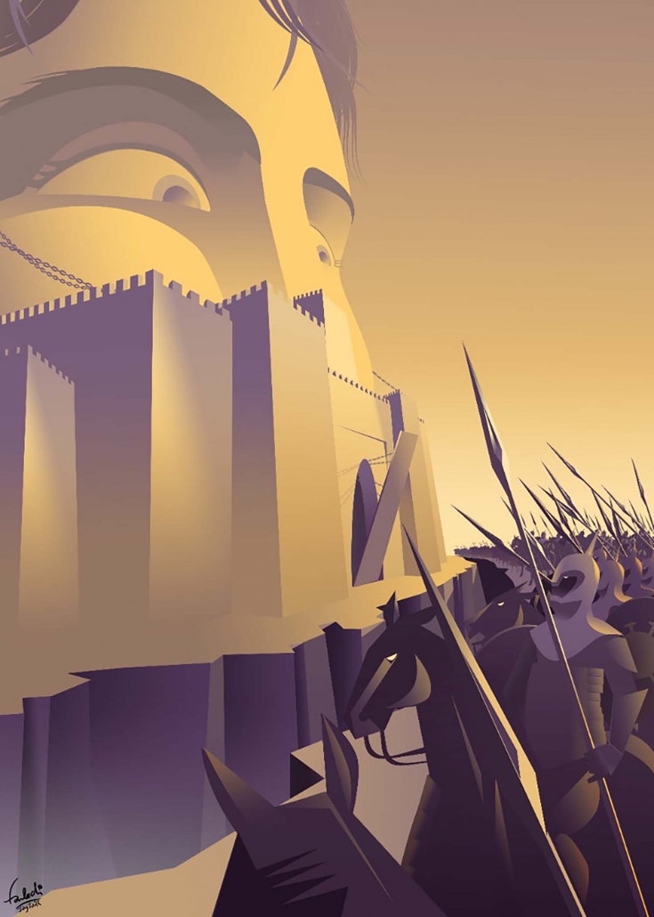
My main experience as a concept artist is creating a world for an animation called: Diasporan, an award-winning animated web series that tells the stories of daily struggles of immigrants.
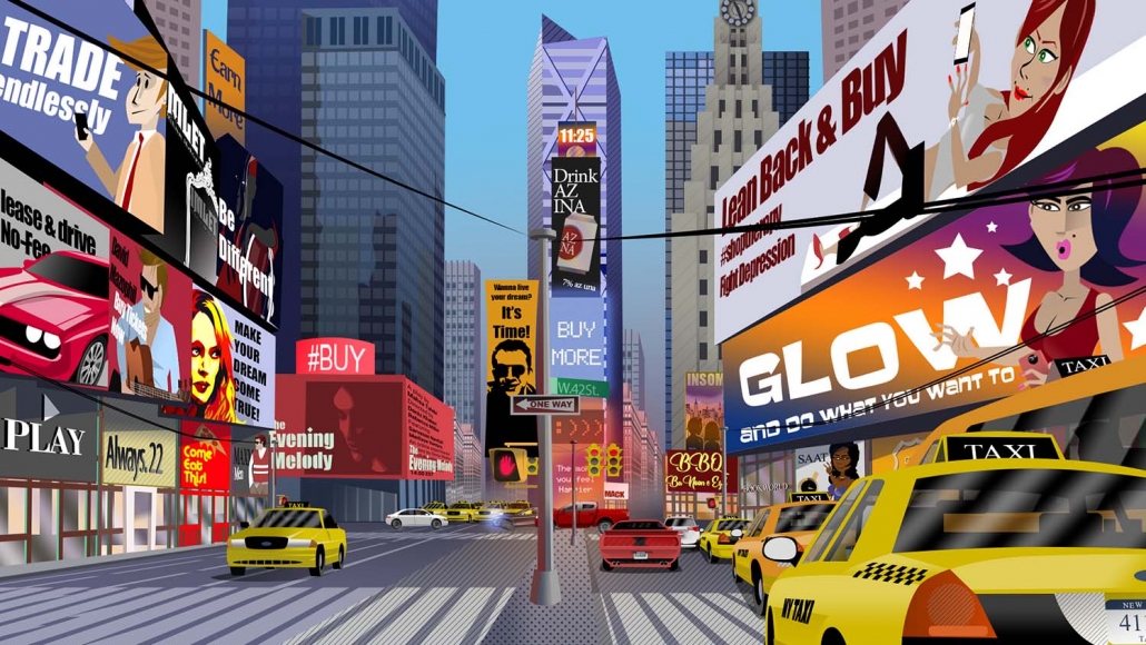
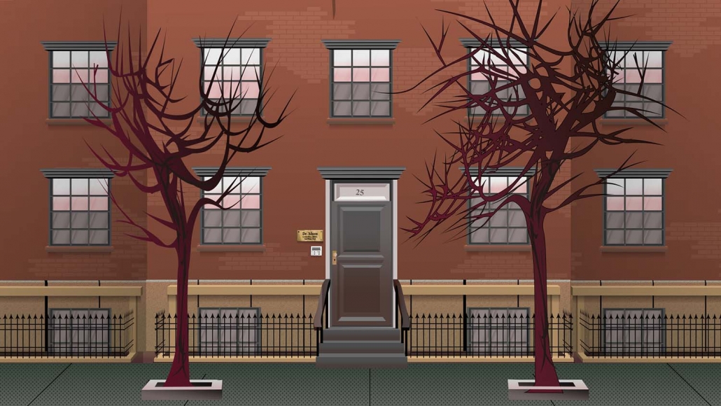
Background design for the project is an important part of its visual identity. During the first episodes of season 1, I started with simple backgrounds but as the project went on, the backgrounds got more elaborated with many details. This trend also continued through season 2 and for the last episodes, making backgrounds became one of the most time-consuming tasks to be done. In episode 12 for instance; as our story occurs in New York, I made more realistic artworks of the city’s skyline and its famous buildings. Illustrating Time Square and Manhattan skyline (the images on the top and end of page 14) took about 100 hours to be finished.


Some of my background designs for Diasporan mini-series (Season 2)
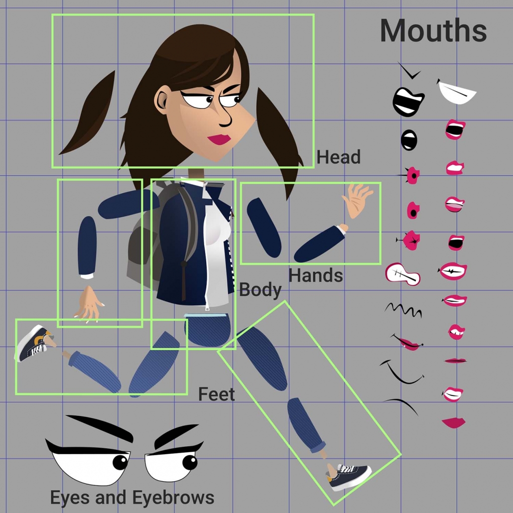
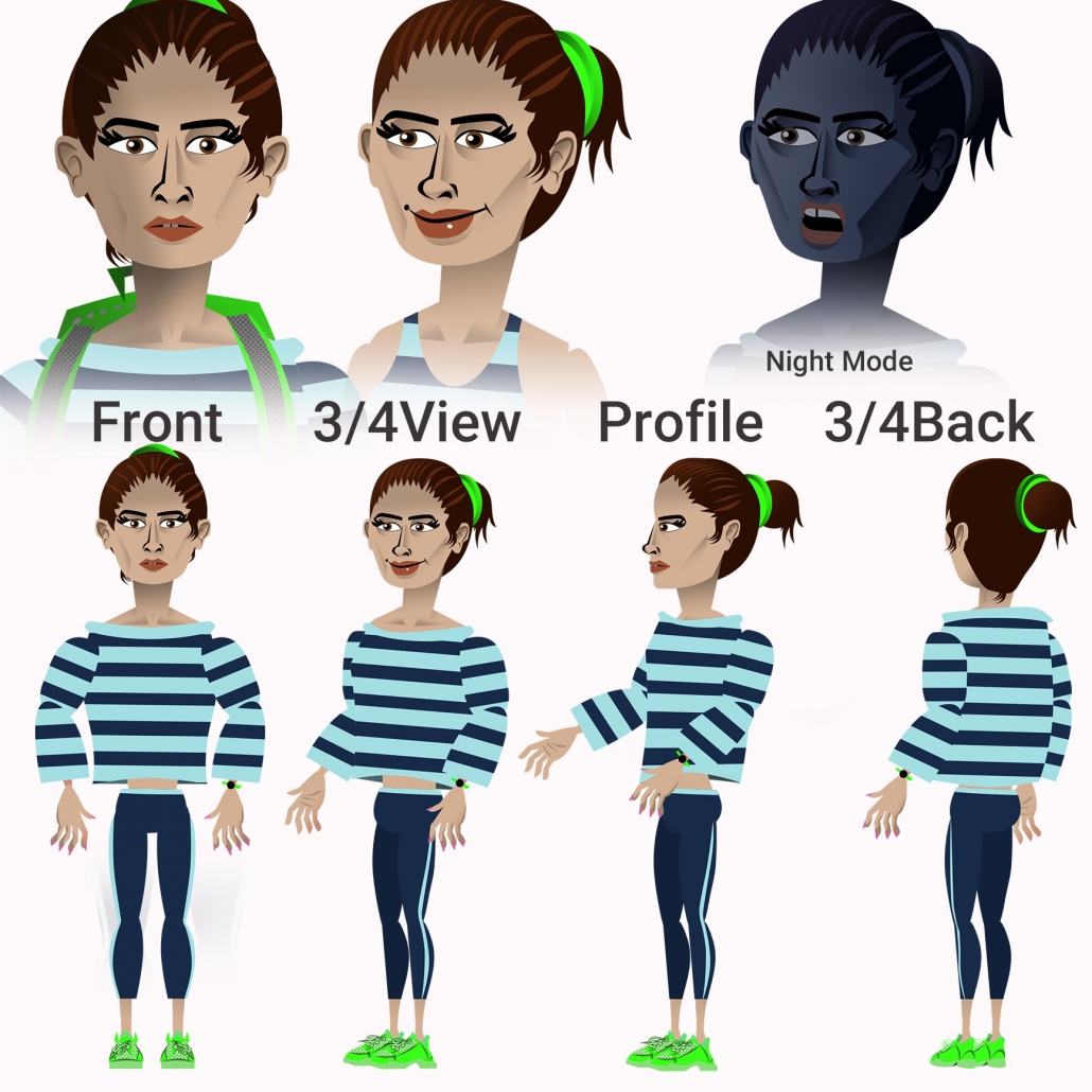
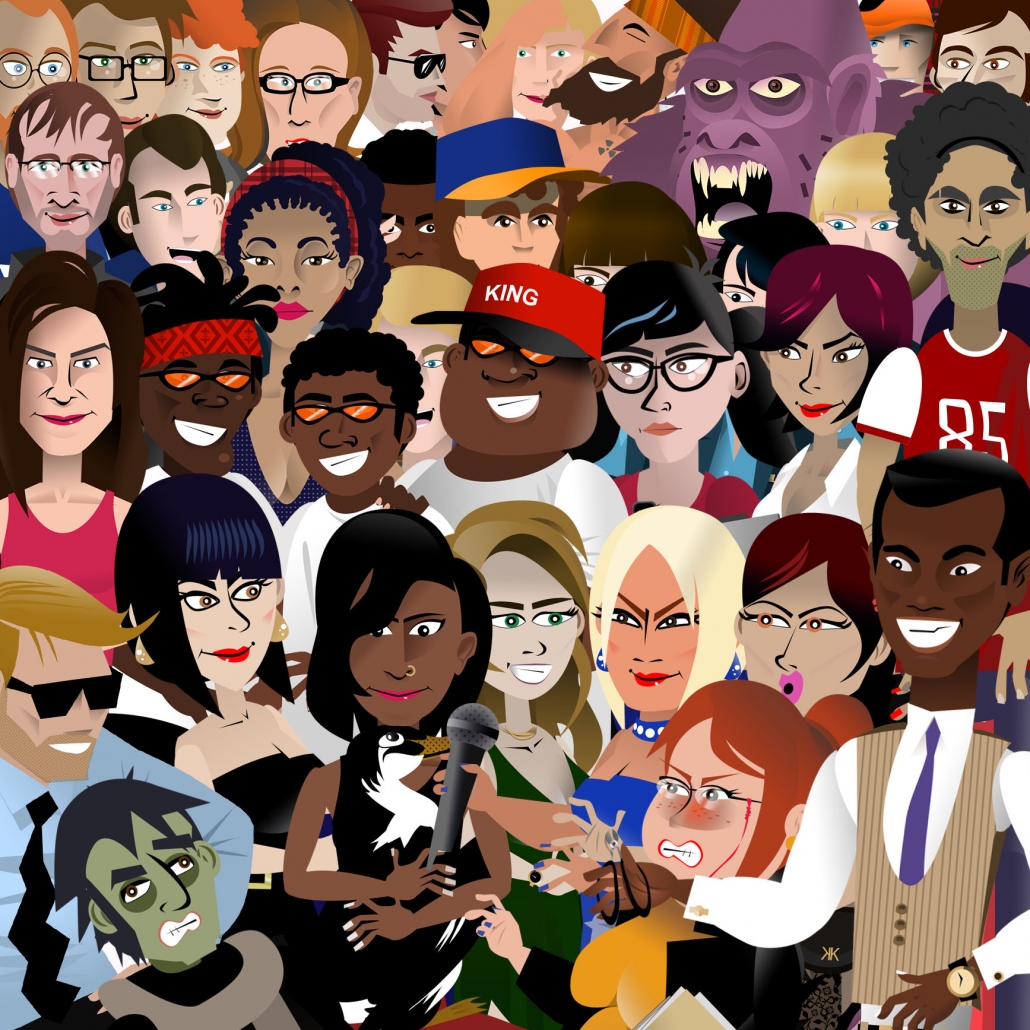
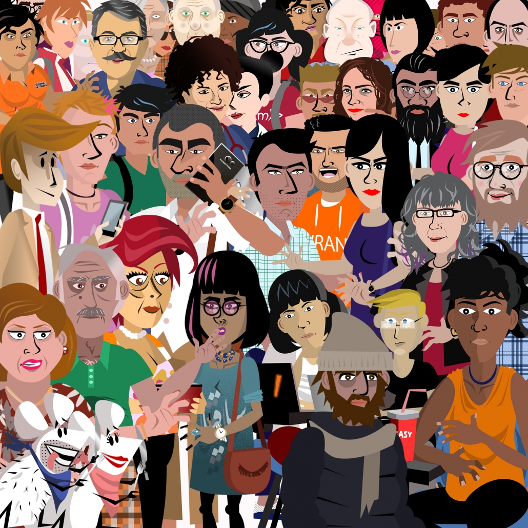
Designing characters for Diasporan was one of the first things to be done early in 2017 alongside with the scripts. I started with the main character, Parastoo and so, other characters were born from her design. the evolution in characters can be seen in the images on the right (top: season 1, down: season 2). other characters also had the same evolution from season 1 to 2. Shading details, articulation, clothing features, etc. changed in the transition from season 1 to 2. Each character -even side characters- was discussed between me and Deniz (the director and playwright) based on the scripts and some had three to four variants before being used. That was because some characters needed to reflect a part of society and so their features had to be designed carefully to avoid stereotypes from one side and to make a proper meaningful connection to the audience from another.


Characters Design for Diasporan mini-Series
Characters in the first episode of season 1 were designed based on pixels and animated mostly by using puppet tool in Adobe AE, but from the second episode on, they are all vector based and animated by different joints, rigged together.
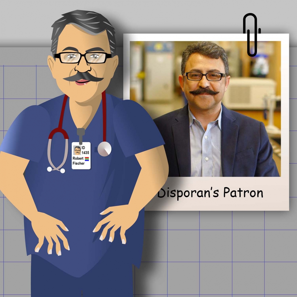
Parastoo, our main character is the one with different customs, the rest are mostly appear with a fixed outfit. We also make characters of our level 3 patrons and fit them into story (Image on the top of next page).
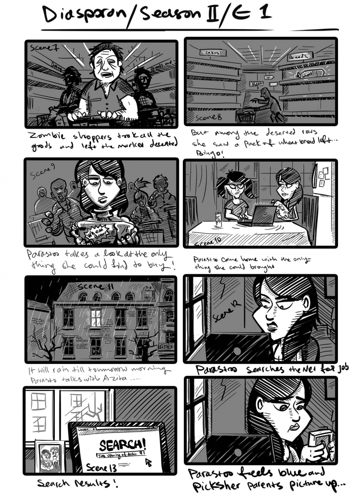
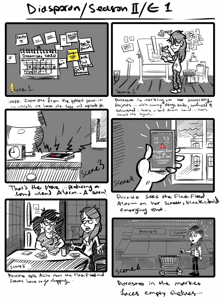
Another responsibility of mine in creating Diasporan mini-series was making the storyboards based on the scripts.
This was one of the first things to be done prior to creating illustrations, animating characters, recording voice-overs, and producing music and sound effects. Although every team member had an idea about each episode’s story-line, without a clear story-board neither of my team members could understand what exactly to do. So, before making either of Diasporan episodes, the playwright and I used to have multiple sessions and subsequently I started to depict the story-line in a dozen of frames with the characters in their places, backgrounds’ sketch, and all other objects and details.
there were also text clues related to the parts of the script, so everybody could have a clear image of how things should be going on through the episode.


Some of Diasporan season 2 storyboards by me
Since 2017, I have been the head of Bank Pasargad’s social network and content team, later in March 2020, I promoted as the bank’s head of media and communications team. During that period, my responsibilities were ideation and writing scenarios for motion-graphics and making sketches for infographics introducing the bank’s products and services.
Firstly, my colleagues and I had meetings to check on new regulations, products and service updates, and latest customers’ feedback. Then, while deciding on the topic, benefiting from storm-braining we examined suitable ideas for making related content.
After writing the scenario draft, proofreading and editing, the executive process began. Once the first version of the content released, we used to check it for clarity of the message. Usually, after some further edits, the final work was ready to be published.


Some of motion graphics made for the bank’s social media
Designing content for banking services and processes is so challenging and complex. The abstract nature of the products, complicated processes of using those services and lack of visual symbols presenting banking concepts, are some of the limitations that forced us using narrations, actors or writing long phrases in our motion-graphics and clips.
Apart from that, the bank’s strict guidelines for using formal language and graphic elements prevented us from making use of a friendly and everyday language -which, in Persian is far different from formal speech- and attractive graphic symbols common in making motion-graphics was a serious challenge.
While creating infographic contents for banking services, I faced the same challenges such as complicated concepts for being illustrated, scarcity of graphic symbols, and the brand’s guidelines. For example, while creating an infographic for our domestic L/C service (the image below) we could not find any graphical solution to simplify the general image of the service. So, we only used an Iran map to emphasize domestic nature of the service and using number bullets, arrows, and putting stress on characters’ body gestures presented a general idea of how this product works.


Some of infographics made for promoting banking services
In another case, to design an infographic to describe a process for selling customers’ state stock via the bank’s branches, complexity of the process caused the work to be revised several times for making it more comprehensible (pictures on the left and down). Hopefully, due to proper numbering and removal of some exceptional situations in the process, the audience feedback was satisfying. Using the diagrame, the customers were able to get a clear idea of how they should go through the process and a significant drop in our related instagram DMs (customers questions over the process) confirmed so. The diagram also was so helpful our colleagues in the bank’s call-center; they had referred phone clients to the diagram on the bank’s Instagram page in order to avoid long explanations and confusing customers.


Process of making an infographic to describe a banking procedure